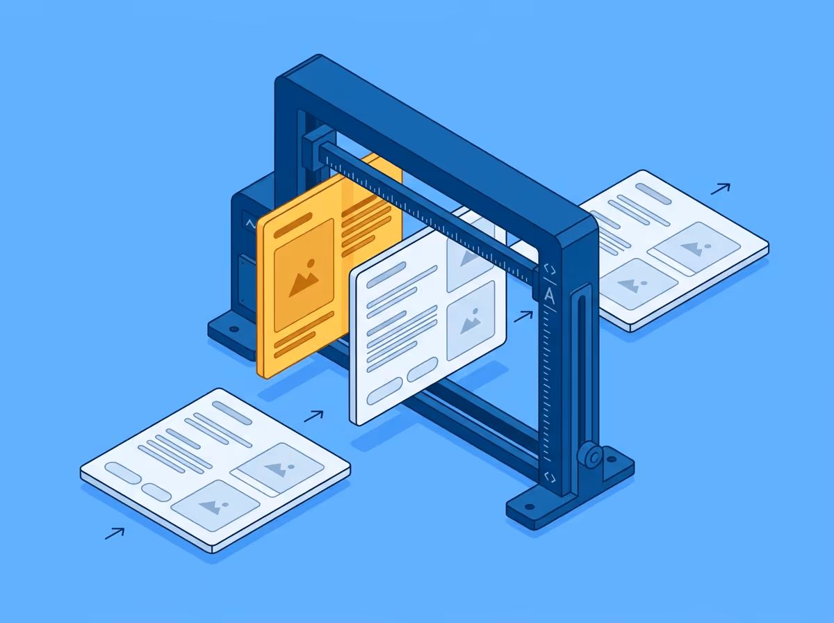
Visual QA is the process of checking whether a web page looks the way it was designed to look. It compares the rendered implementation against the original Figma design and surfaces differences in spacing, typography, colour, layout, and component dimensions. Functional testing checks whether things work. Visual QA checks whether they look right. The two are complementary and neither substitutes for the other.
Functional tests verify behaviour. A button does what it should when clicked. A form validates input correctly. A page loads within an acceptable time. None of that tells you whether the button is the right size, the form has the right spacing, or the page looks like what the designer intended.
Visual differences that functional tests miss include things like:
These accumulate across a page, and a page with many small visual deviations does not reflect what was intended.
Visual QA typically happens after implementation and before release. In practice it can happen at several points:
During development. A developer checks their own work against the design before marking something ready for review. This catches the cheapest problems at the moment when context is freshest and fixing something is quickest.
During design or QA review. A designer or QA engineer checks the implementation against the Figma design. This is where most visual issues are caught in teams that do not check during development. By this point the code has usually been reviewed and merged, so fixes require reopening work that was considered done.
After release. Stakeholders or users notice that something looks off. This is the most expensive point to catch a visual issue, both in terms of the effort to fix it and the time it has been visible to people outside the team.
The earlier visual QA happens in the cycle, the lower the cost of acting on what it finds.
The most common form of visual QA is manual: a person opens the design and the implementation side by side and looks for differences. This works for obvious deviations. It struggles with anything subtle.
The human eye is not a measuring instrument. A spacing value that is 14px instead of 16px is not something most people notice without a reference. A font weight of 400 instead of 500 looks nearly identical at small sizes. Colour differences within the same family are easy to accept as correct without comparing hex values directly.
The same implementation might pass review on one day and get flagged on another, depending on who is looking and how carefully.
Automated visual QA compares rendered output against a design reference geometrically rather than perceptually. Instead of asking whether something looks right, it measures whether it is right.
A spacing value is either 16px or it is not. A font weight is either 500 or it is not. These comparisons do not depend on the reviewer's eye or their tolerance threshold on a given day. The result is the same regardless of who runs the check or when.
This makes visual QA a repeatable process rather than a variable one, which matters particularly as implementations grow more complex and teams grow larger.
Free to start. No credit card. See your first comparison in under a minute.
The fastest way to see how your implementation compares to the design. No screenshots, no guessing
Compare
© 2026 · Built by UIPROBE
