Visual QA for QA engineers means verifying that a live page reflects its Figma design. It is a distinct discipline from functional testing: where functional tests verify that things work, visual QA verifies that they look right. An implementation can pass every functional test and still not reflect the design. Typography, spacing, colour, and component dimensions can all drift without breaking a single user interaction.
The core task is comparing the rendered page against the Figma design and documenting differences. This is not the same as a developer's pre-review check, where the goal is to catch drift before submission. A QA engineer's visual check happens later in the cycle, as part of formal validation before release, and covers pages that may have been built by multiple developers over multiple sprints.
The properties that matter are consistent across most implementations: font size and weight, line height and letter spacing, spacing between and around elements, component dimensions, colour and opacity, borders and border radius. A thorough check covers each of these for the elements on the page being validated, not just the ones that look visually prominent.
The challenge is consistency. A QA engineer checking pages manually will notice different things on different days. Two QA engineers checking the same page will not necessarily flag the same deviations. This inconsistency is not a skill problem. It is the predictable result of asking people to perform a task that requires sustained, calibrated attention across a large number of elements.
Functional tests produce consistent results. The same test, run on the same implementation, passes or fails the same way every time. The criteria are defined in advance: this button triggers this action, this form validates this input.
Visual QA does not have the same built-in consistency when done manually. Whether a spacing value of 14px instead of 16px gets flagged depends on who is checking and how carefully. Whether a font weight of 400 instead of 500 is noticed depends on the reviewer's eye and their tolerance on that particular day.
This is the core problem with manual visual QA as a formal process. It produces variable outcomes from the same inputs, which makes it difficult to maintain a consistent quality standard or to know what level of visual accuracy is actually being upheld across releases.
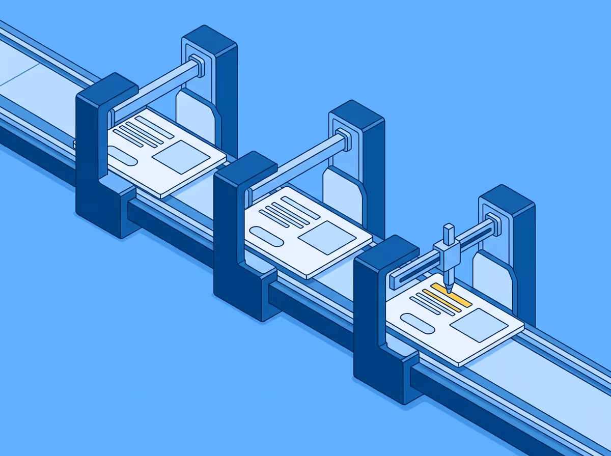
A repeatable process produces the same result regardless of who runs it. For visual QA that means the comparison method has to be geometric rather than perceptual: measuring actual rendered values against design specifications rather than relying on the eye to detect differences.
The output of a repeatable process is a documented list of specific differences with values. Not "the heading looks slightly light" but "font weight is 400, design specifies 500." Not "the spacing feels tight" but "gap between card and label is 12px, design specifies 16px." Specific findings can be acted on in one round. Impressions generate back-and-forth.
With a documented list of specific differences, a QA engineer can make consistent decisions about which deviations are within acceptable tolerance and which require a fix, based on criteria that apply the same way across every review cycle.
Visual QA sits at two points in a typical QA process.
The first is feature validation: verifying that a new implementation reflects the design before release. This is where most visual drift gets caught or missed. If the comparison is systematic and specific, it catches the deviations that a developer's own review missed. If it is impressionistic, it catches the obvious ones and lets the subtle ones through.
The second is regression: checking that existing pages still reflect their designs after codebase changes. A CSS update intended to fix one component can shift values across the product. A design token change can cascade in ways that are not obvious from the code diff. Running a comparison against the Figma designs for high-visibility pages after significant changes is the most reliable way to catch visual regressions before they reach users.
Free to start. No credit card. See your first comparison in under a minute.
The fastest way to see how your implementation compares to the design. No screenshots, no guessing
Compare
© 2026 · Built by UIPROBE
