Validating your UI before code review means comparing the rendered implementation against the Figma design before you submit anything for review. It catches visual differences at the point when the code is still open, the context is fresh, and a fix takes minutes rather than a round trip through the review process. Font weights, spacing, component dimensions, colours: these are the things that drift during implementation and are cheapest to fix before anyone else sees them.
Code review is for logic, architecture, and correctness. It is not well-suited to catching visual drift, and most reviewers do not check it systematically. The result is that visual differences routinely survive code review and surface later: in design review, in staging, or after release. At which point fixing them requires reopening work that was considered done.
The cost compounds at each stage. A spacing value caught during development takes seconds to fix. The same issue caught after merge requires a new branch, a new review, and another round of the same process. Multiply that across a sprint and the overhead adds up.
The other problem is that code reviewers are looking at the code, not the rendered output. A stylesheet value that looks correct in a diff can produce a different visual result than intended once it interacts with the rest of the page. Code review cannot catch that. Only looking at the rendered page against the design can.
The check does not need to be exhaustive to be useful. Most visual drift falls into a small number of categories, and checking those systematically covers the majority of what a designer or QA reviewer will catch later.
The properties worth checking before review are the ones most likely to have drifted during implementation: font size and weight, line height and letter spacing, spacing between and around elements, component dimensions, and colour. These are not things that need to be checked pixel by pixel across the entire page. They need to be checked for the elements you just built.
The most reliable way to check is to compare the rendered output against the Figma design directly rather than relying on a visual scan. The eye misses small differences, particularly in the implementation you just built. Your brain fills in what it expects to see rather than what is actually there.
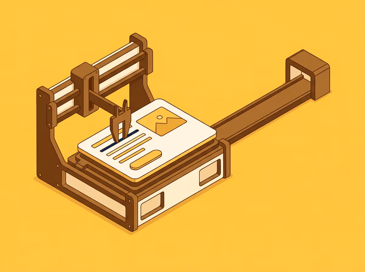
Uiprobe automates this comparison. It reads properties from the Figma frame and the live page, then surfaces the specific differences with expected and actual values, so you can fix them before submitting for review.
There is a useful framing shift in how to think about this check. It is not an audit you run to find out whether something is wrong. It is preparation: arriving at the review knowing where things stand, with the confidence that comes from having actually checked.
That changes what the review is for. When visual issues have been caught and fixed before submission, the review becomes a place to discuss decisions and trade-offs rather than to discover implementation drift that should have been found earlier. Reviewers spend their time on things that genuinely need a second opinion.
It also changes the dynamic with designers. A developer who consistently submits work that reflects the design does not generate the same feedback loops as one who submits first and corrects later. The relationship improves because the back-and-forth shrinks.
The check is most valuable when it is routine rather than occasional. Running it before every submission, as a standard step before marking anything ready for review, is what prevents drift from accumulating.
The friction involved determines whether it actually happens. A check that takes an hour is not going to happen consistently. A comparison that runs in a few minutes and shows specific differences with values is much more likely to become part of the workflow.
Uiprobe compares rendered web pages against Figma designs and surfaces visual differences before they reach review. Try it free.
Free to start. No credit card. See your first comparison in under a minute.
The fastest way to see how your implementation compares to the design. No screenshots, no guessing
Compare
© 2026 · Built by UIPROBE
