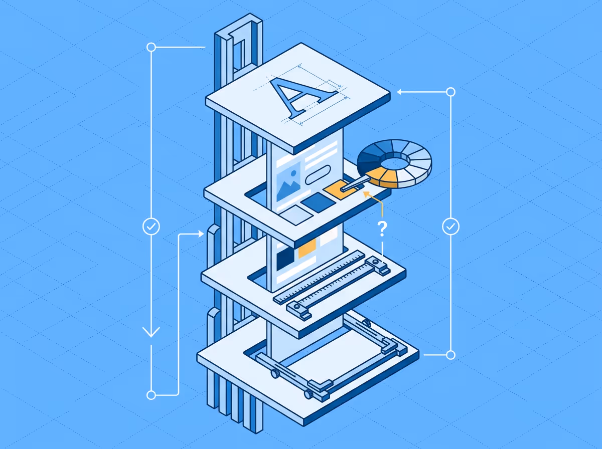
A design QA checklist covers the visual properties you verify when comparing a live web page against its Figma design: typography (font family, size, weight, line-height, letter spacing), colors (fill, text, border, icon), spacing (margins, padding, gaps between elements), sizing (element width and height), content (text accuracy, image rendering), responsive behavior across breakpoints, and interactive states (hover, focus, active, disabled). The checklist below is organized by property category with specific values to check and common implementation mistakes to watch for.
Most design QA problems are not dramatic. They are small, cumulative deviations that individually look fine but collectively make the page feel off. A font weight of 400 instead of 500, 12px of padding instead of 16, a border color one shade lighter than the design token. This checklist helps you catch them systematically instead of relying on visual scanning.
The goal is not pixel-perfection. It is knowing exactly where the implementation diverges from the design before anyone else has to tell you.
Typography is where the most deviations happen, because Figma and CSS handle text properties differently.
Font family. Confirm the rendered font is the one specified in the design, not a fallback. Browser DevTools shows the "Rendered Fonts" section under the Computed tab, which tells you which font file actually loaded. If the web font failed to load, the page may look roughly correct with a system fallback but the typography will be wrong.
Font size. Compare the pixel value in Figma against the computed font-size in the browser. Watch for rounding: Figma may specify 15px, but a rem-based system could render 15.008px or 14.992px depending on the root font size.
Font weight. Figma shows weight as a style name ("Medium", "SemiBold") while CSS uses numeric values (500, 600). The mapping is not always obvious. "Medium" is 500 in most font families but some use non-standard mappings. Check the computed value, not the stylesheet declaration.
Line height. This is the single most common source of Figma-to-CSS drift. Figma can express line-height as a pixel value (24px), a percentage (150%), or "Auto." CSS computes line-height as a unitless ratio, pixels, or a percentage, and the interaction with font-size means the same visual result can have different numeric values. Compare the computed pixel output, not the raw numbers.
Letter spacing. Figma expresses letter-spacing as a percentage of font size. CSS uses pixels or ems. A Figma value of 2% on a 16px font equals 0.32px in CSS. Small differences compound across headings and body text.
Text transform. Check whether uppercase, lowercase, or capitalize transformations in the design are applied via CSS text-transform or hardcoded in the content. Hardcoded transforms break when content changes.
Fill colors. Compare hex or RGB values between Figma and the computed background-color or color in the browser. Watch for opacity: Figma may show a solid color that is actually a semi-transparent layer on a specific background. The computed color in the browser will be different if the underlying HTML structure differs.
Text colors. Same approach as fill, but check the computed color property specifically. Inherited colors from parent elements can override what you expect.
Border colors. Often missed because borders are visually subtle. Check computed border-color against the Figma stroke color.
Icon colors. SVG icons inherit color from CSS or use fill/stroke attributes. Confirm the rendered color against the design, especially for icons that change color on hover or active states.
Design token consistency. If the team uses a design token system, check that the implementation uses the correct token rather than a hardcoded value that happens to be the same color today. This prevents drift when tokens are updated.
Spacing is hard to verify visually because 4px differences are invisible at normal zoom. This is the category where manual checking is least reliable.
A 4px spacing deviation is almost always a real implementation error, not a rendering artifact. But your eye will never catch it without measuring.
Padding. Internal spacing within elements. Compare the computed padding values (top, right, bottom, left) against the Figma auto-layout padding.
Margins. External spacing between elements. Figma uses "gap" in auto-layout and manual spacing for non-auto-layout frames. Watch for margin collapse in CSS, which has no equivalent in Figma. Two adjacent elements with 16px margin each will have 16px between them in the browser (collapsed) but 32px in Figma if laid out without auto-layout.
Gap. Flexbox and grid gap values. Compare against the Figma auto-layout gap. This is usually the most reliable spacing property because both Figma and CSS express it the same way.
Alignment. Check whether elements that should be centered, right-aligned, or baseline-aligned actually are. Sub-pixel rendering can make centered elements appear 1px off, which is usually acceptable, but a left-aligned element in a centered container is a real finding.
Element width and height. Compare computed dimensions against the Figma frame size. Be aware that Figma dimensions include padding, while CSS box-sizing determines whether width includes padding or not. With box-sizing: border-box (the modern default), the behavior aligns with Figma. With content-box, it does not.
Max-width and min-width constraints. The design may specify a fixed width, but responsive implementations use max-width. This is expected behavior, not a deviation. Check that the max-width matches the design's intended maximum.
Aspect ratios. Images and media elements should maintain the aspect ratio from the design. Check for stretching or cropping that differs from the Figma frame.
Text accuracy. Compare rendered text against the Figma text content. Look for truncation (text cut off by overflow: hidden), line breaks in different positions (caused by width differences), and missing or extra whitespace.
Image rendering. Check that images are the correct asset, at the correct resolution, and not visually compressed or upscaled. Retina displays need 2x assets; if the design was built at 1x, the implementation may look blurry on high-DPI screens.
Missing or extra elements. Scan for elements present in the design but absent on the page, or elements on the page not in the design. This includes icons, decorative elements, dividers, and background shapes that are easy to overlook.
Breakpoints. Verify that the implementation has the same breakpoints as the Figma design. Resize the browser to each breakpoint width and compare layout, typography, and spacing at each.
Stacking order. Elements that sit side by side on desktop often stack vertically on mobile. Check that the stacking order reflects the design.
Hidden or shown elements. Some elements appear only at certain breakpoints (mobile menu vs desktop nav, for example). Confirm that visibility toggles at the correct breakpoint.
Touch targets. Mobile breakpoints should have tap targets of at least 44x44px. This is often a design spec, but implementations sometimes render smaller hit areas.
Hover states. Buttons, links, and interactive elements should change appearance on hover as specified in the design. Check background color, text color, border, and shadow changes.
Focus states. Keyboard-accessible focus indicators should be visible and styled. If the design specifies custom focus styles, verify they are implemented and not overridden by browser defaults.
Active and disabled states. Confirm that pressed/active states and disabled states render correctly. Disabled elements should have the correct opacity or color treatment from the design.
Transitions. If the design specifies animation or transition timing, check that the CSS transitions use the correct duration and easing.
A checklist like this is thorough but slow when done entirely by hand. Checking typography properties across every text element on a page means opening DevTools, selecting each element, reading computed values, and comparing against the Figma frame. For a typical page with 30+ text elements, 20+ spacing relationships, and a dozen color values, a manual check takes 30 to 60 minutes.
Property-level design QA tools automate the property-by-property comparison step. They read the Figma design properties and the browser's computed CSS values, then surface the specific deviations. Uiprobe checks the typography, color, spacing, and sizing categories from this checklist automatically by comparing a Figma frame against the live page. The checklist above describes what those tools check automatically. Using a tool for the property and spacing categories frees up manual review time for the things tools are less reliable at: responsive behavior, interactive states, and content accuracy.
Run the automated comparison first to catch the measurable deviations. Then use the responsive and interactive state sections as a manual pass.
Before every code review or design sign-off. Running a quick comparison before requesting review catches the obvious deviations before they become feedback comments. It is faster to fix a spacing problem yourself than to receive it as review feedback, context-switch back to the file, and fix it then.
Developers should self-check before requesting review. Designers or QA engineers should verify during or after review. The checklist works for all three roles. The difference is when in the workflow they use it.
This depends on the team. Some teams enforce pixel-perfect spacing. Others accept 1-2px deviations as rounding artifacts. What matters is that the tolerance is explicit and agreed, not discovered during review. A 4px deviation is almost always a real implementation error rather than a rendering artifact.
For a thorough review, yes. In practice, focus on hero sections, navigation, key CTAs, and any components that repeat across pages (cards, list items, form fields). A deviation in a repeating component multiplies across every instance.
Free to start. No credit card. See your first comparison in under a minute.
The fastest way to see how your implementation compares to the design. No screenshots, no guessing
Compare
© 2026 · Built by UIPROBE
